

Typography in Japanese Manga
DVB201: Final zine
The concept I chose to focus my Zine is the Typography found specifically on the cover of Manga (Japanese Comics). I though this would be an interesting topic as they often combine both the Latin alphabet with Japanese characters, and because Japanese contains three alphabets that all have different styles and forms so there is a lot of variety when it comes to text. To begin my Zine, I researched about the Japanese writing system, characters, and some commonly used fonts. I also researched about Manga and some characteristics that could inspire my Zine.
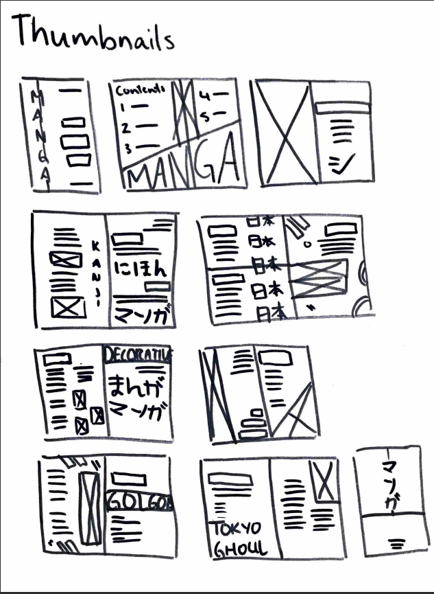
Thumbnails
grid structure
grid structure
Below are some spread designs that did not make it into the final zine.


FINAL zine


mockups


design decisions
Type Faces
In my Zine I used a combination of the Latin alphabet and Japanese characters. As a result, I had to use multiple typefaces to display both languages. For the Latin typefaces, I used Eras Bold ITC and Myriad Pro in regular and bold. These two typefaces are very simple and minimal sans-serif fonts and were chosen to be practical considering that I would be working with a variety of complex Japanese characters and decorative typefaces; therefore, I did not want any of the English text to clash with the Japanese and kept them very simple. If I had chosen a more ‘oriental’ or ‘Japanese-style’ typeface, not only would it be inappropriate, but it would make the Zine very busy and crowded (Bringhurst, 2012).
I used multiple Japanese typefaces as they were used more for visual display rather than any body copy or headings. The fonts used in this zine include:
- Yu Mincho
- Yu Gothic
Both of which are a relatively standard in terms of Japanese fonts. Mincho is similar to serif Times New Roman, and Gothic is similar to a sans-serif like Arial or Calibri (Nagase, 2016). The next typefaces listed are decorative display fonts that have been used strictly for visual purposes. They show the different ways that the Japanese can be altered depending on the typeface which is why they were used in the Zine’s design.
- Kana0816
- Shirousagi
- Atomic
- Tampopo
- Donut Shop
Colour
I chose Red and Black (plus stock colour) for my Zine’s colour scheme. The red was chosen, not only as a pop of colour against the black and stock colour, but it is also a colour commonly used on manga covers, especially action or superhero manga. The black was chosen so that when placed with the red, the text would be easily legible.
Hierarchy
I created hierarchy using a variety of strategies. One of the main ones being hierarchy using Size and Weight. The headings and most important information were scaled up significantly and bolded so that it dominates the page regardless of its position. In saying that, majority of these headings were positioned at the top of the page so that the reader will naturally receive that information first. An interesting technique for creating hierarchy that I only used on a couple of pages is creating hierarchy using orientation. On the title page and on page 4, the English headings have been placed vertically. This was chosen to mimic the writing style of Japanese as well as create hierarchy by standing out against the standard horizontal text (Saltz, 2013).
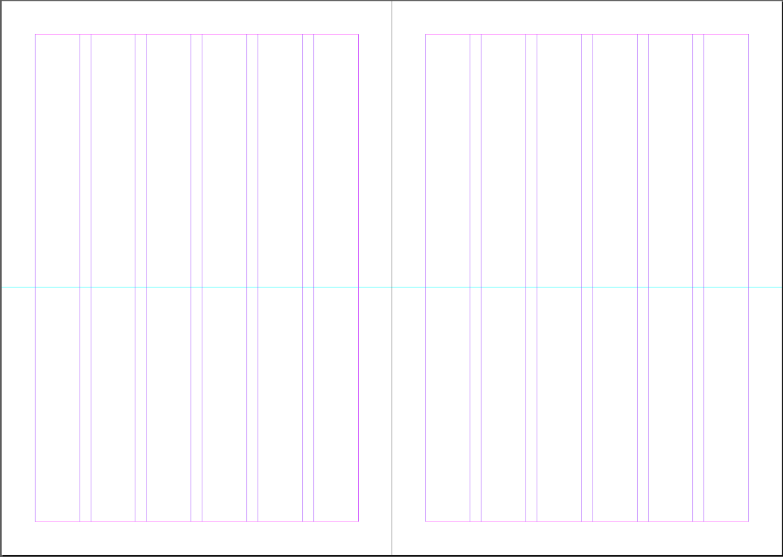
Grid
I chose a 6-column grid as it allows me to use a variety of alignments on the page. For example, halves, thirds, or sixths. This allows me to do a variety of alignments whilst keeping a level of consistency within the Zine. Most of the time I placed text within half of the grid (3 columns), especially the body copy, as it created clean columns that kept information together and were wide enough to be easily readable.
Alignment
I used multiple alignments in my Zine. These were used depending on the page’s topic and how much content there was. On pages where there is a mix of left and right alignment, there are usually multiple topics being discussed and the different alignments are used as a way to organise the information in an interesting and dynamic way. Centre alignment is only used a couple of times, this being the introduction, page 4 about Kanji and the back cover. This alignment has been used here as there is not a lot of information and I wanted to keep the content front and centre so that the page does not look empty.
Visual elements
For example, on page 4, Japanese Kanji was used to give an example of Kanji’s with a different number of strokes, whilst creating bold dividers between the body copy, or on page 6 where the same Japanese characters were used in two different typefaces to highlight to the reader the differences between them, as well as to fill in the blank black space with something that reflects the content.
Final Reflection
Overall, I am happy with my zine and the topic I chose. It is a topic that I am personally interested in, so I had a lot of fun writing about it and making a Zine that fit this theme. I really wanted my Zine to emulate the cool world of manga and I feel as though it does so effectively. The spreads are visually dynamic and interesting yet not too crowded and busy. I also think the colours contrast well against each other and fit the tone of the chosen topic. The typography was considered carefully and works well with each other without clashing with any other typefaces. My favourite pages are 5 and 6, because I feel the typographic elements are the most creative and visually interesting on this page. I also really like how the characters pop against the black background.
References
Content
Saito, T. (1968). Golgo13. Japan: Shogakukan
Ishida, S. (2011). Tokyo Ghoul. North America: Viz Media
Nagase, E. 2016. Seven rules for perfect Japanese typography. AQ. https://aqworks.com/en/blog/2016/09/20/perfect-japanese-typography/
Nihongo Resources. No date. Japanese scripts. Nihongo Resources. http://www.nihongoresources.com/language/writing/typefaces.html
Palmieri, C. 2004. Japanese Typography on the Web and Beyond. LukeW. https://www.lukew.com/ff/entry.asp?111
LinguaLift. 2020. 10 Beautiful Japanese Fonts. LinguaLift. https://www.lingualift.com/blog/japanese-fonts/
Toleva, G. 2019. Ever wondered which Japanese fonts you should use?. Pulse of Asia. https://www.1stopasia.com/blog/ever-wondered-which-japanese-fonts-you-should-use/
Forsberg, J. 2020. Shodō – the art of Japanese calligraphy. Go! Go! Nihon. https://gogonihon.com/en/blog/shodo-japanese-calligraphy/#:~:text=Japanese%20calligraphy%20is%20one%20of,from%20elementary%20school%20throughout%20university.
Design
Nagase, E. 2016. Seven rules for perfect Japanese typography. AQ. https://aqworks.com/en/blog/2016/09/20/perfect-japanese-typography/
Bringhurst, R. (2012). The Elements of Typographic Style (4th ed.). Hartley and Marks. https://content.talisaspire.com/qut/bundles/604029c347e64316730f0cb4
Salts, I. (2013, November, 25). Creating hierarchy using position [Video]. In Typography: Hierarchy and Navigation. LinkedIn Learning. https://www.linkedin.com/learning/typography-hierarchy-and-navigation/creating-hierarchy-using-position?autoplay=true&resume=false&u=57080313

